17 May 2001
[ work in no progress ]
Most people I know use WYSIWYG text editors to compose pretty documents, including e-mails and web pages. They appreciate typing and seeing only what they feel concerned with - after all, computers should work for them, not the opposite.
However, they are perversely led into spending some time setting the look of several parts of their documents in a way that is only interesting in short term and for few small personal documents. For example, they simply mark every subsection titles in their document as using bold and big characters. They would not tell the computer that those isolated sentences in bold are somehow subsection titles. Why would they anyway? When they change their mind about the character size or when they merge two different documents, they would go through all the subsection titles again and apply the desired change. When they do not forget some.
They are actually getting back to old times - times when people were patiently hand composing books and newspapers on printing presses. With a difference: they now work with sophisticated and powerful but also disabled hands...
Disabled, you ask? You never had any trouble at the frontier between a list of items and a normal paragraph? The frontier is hard to settle with a WYSIWYG editor. More subtle or clearly embarrassing drawbacks appear once you have to work with long documents, documents you wrote five years ago, documents from other people, or documents that interact with different materials. In particular, the present WYSIWYG way is not well adapted to internet: files get oversized, which is a pain in the neck for my very slow internet connection; web pages seem hard to compose and to lay out nicely; and the logical structure of web pages is left unspecified or is a mess, which is a pain in the neck for the many braille terminals out there nowadays - to mention only an immediate consequence.
There has always been an alternative way to compose texts. [ ... using simple text editors and knowing bits of html, LaTeX, ... focusing on the document's structure by labelling/tagging every parts and using a general style sheet to define how each kind of part should be rendered ... ] It has far better results in many respects but it is not visually comfortable and it does not appeal to many people.
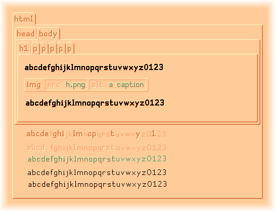
[ to be continued... I'm going to suggest some more comfortable view of source codes. Could apply to programming languages as well. An improvement over indentation and syntax coloring. Some better visual analogy with the physical world might help to distinguish a document's content from its structure and see both easily at a glance. Above you can see a picture that shall eventually show a piled up view of this very web page. I only started - the text content is supposed to be rendered in black ink. Don't pay attention to the scribble I've left on the picture. Non-piled views should be available too. ]